urbanus vulgaris

urban life & culture / ideas & insights / innovation & development

Category: infographics

Eye catching

by gailiute

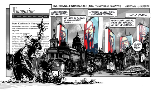
nk16_biennale-non-banale_sm

Sometimes I like to stare at nice, eye catching graphics, thinking one day I will start drawing them too :)

Today I stumbled upon this blog:  http://klaustoon.wordpress.com (where I also found this image) and I think it is quite nice work.

Suburbia is starting to die?

by gailiute

1335545624-suburb-intro1

While scanning through numerous articles about suburban life, I came over a few articles and posts that american dream of living in a nice suburban house actually is not a dream anymore. Well, at least for a small, but constantly growing part of society. Authors basically support this idea of decreasing amount of car users in generation Y (by the way, I did not know that we are called generation Y, that’s something new for me!) and increasing per cent of suburban poor, which means, according to the authors, that higher educated or “smarter” or anyhow “better” people tend to exchange suburbs to a better & compact city life. Of course, the authors admit that there will always remain those, who, despite anything, will adore suburban life.

Well, could be true, could be just a nicely played with a few statistical figures, but good to know.

And as for us, in Lithuania, I don’t think that suburbia is going to die soon, we’re just in the middle of creating it. Still need some time..

Pictures taken from here:

http://www.archdaily.com/230276/infographic-burbs-going-bust/

1335807541-suburbia3

Good.is

by gailiute

Though I found this page accidentally and intended to add it as a nice and very clearly done example of website in the info graphics post, I decided that it is worth to pay your attention to it a bit more.

I think it is great platform for sharing ideas and issues that people care about.

And pay attention how amazingly it plays with words in the website address line: ” good is everyone” ;)

“GOOD is a global community of people who give a damn.”


http://www.good.is/everyone

Mapping 6.0 Again infographics

by gailiute

I find infographics more and more  pulling me in the endless possibilities of sharing information. When I grow up, I will start doing infographics as well, until then, I just look at them ;)

And share with you.

how cool is that to make your portfolio/cv as infographics?

http://richworks.in/2010/04/50-most-stunning-examples-of-data-visualization-and-infographics/


Or to know how to make Any kind of coffee?


http://www.fastcodesign.com/1670599/infographic-how-to-make-every-coffee-drink-you-ever-wanted#1

One of many videos that tries to raise your awareness and warn about the evil google :)

This one is great. (Having in mind music) :)


http://www.smashingmagazine.com/2008/01/14/monday-inspiration-data-visualization-and-infographics/

This one shows the shape of  any song. Example of  Chopin, Mazurka in F# Minor


http://www.turbulence.org/Works/song/gallery/gallery.html

Finally, I cope/paste last part of this blog :

SOURCES AND FURTHER INSPIRATION:

1) Cool Infographics

2) Infographics Showcase

3) Flickr Infographics Showcase

4) AXIS Data visualization Framework

5) Visualize US

6) Data Visualization on the Wikipedia

7) Infographics on the Wikipedia

8 ) Great examples with Tools – Web Designer Depot

9) Deviant Art Infographics Showcase

Mapping 5.0 How many Earths do we need?

by gailiute

Here it comes the 5th post about infographics. It is quite remotely related with urbanism, however here you can find an article how much space would we need if everybody in the world started consuming as e.g. americans.

“Assuming we were able to use all the land on the planet–with the exception of Antarctica– here’s how much of Earth(s) we would need if we all lived like people in Bangladesh (or India. Or France. Or, yes, the U.S)” (Elert, 2012):

Futher reading: Elert E. (2012) http://www.popsci.com

http://www.popsci.com/environment/article/2012-10/daily-infographic-if-everyone-lived-american-how-many-earths-would-we-need

Mapping 4.0 the Internet

by gailiute


If one try to imagine the extent of internet almighty, this website might help in doing so. You can explore its depth here in very nice and catchy way!

http://internet-map.net/

Mapping 3.0 (infographics)

by gailiute

For the past couple of days I can not stop looking for interesting maps and infographics. There are millions of them, a lot of boring but many many are so eye- catching. A lot to learn from. It is impossible to put them all here – and no need to do that. Just some that I find nice.

Found here: http://infographiclist.com/

Found here: http://inspiredm.com/30-infographics-about-infographics/

Found here: http://www.pdviz.com/religions-world-map

Found here: http://www.pdviz.com/studio7


Mapping stereotypes 2.0

by gailiute

Following recent post about the satirical mapping from Alphadesigner, here comes the older maps with the same concept. One of my favourite ones is this one:

Designed and drawn by A. Belloquet; published in Brussels by Vincent in 1882

Image source: University of Amsterdam

Here are the links with a few more similar old satirical maps:

http://bibliodyssey.blogspot.nl/2009/06/satirical-maps.html

http://geographer-at-large.blogspot.nl/2011/06/anthropomorphic-and-zoomorphic_16.html

Mapping stereotypes

by gailiute


One of the better blogs that made my day. Though some of the mappings are older, they are still very inspiring and entertaining. The rule that it is better to see it once than to hear it for 100 times applies here definitely. So enjoy!

mapping-stereotypes